4 Reasons to Visualize Your Data Now
With clever graphics and interactive dashboards, data visualization experts can distill big data into powerful tools anyone can use

.png)
.avif)
There’s a reason classrooms have blackboards and textbooks have diagrams: Visuals make information easier to digest. Pictures can tell stories, infographics bring life to facts and figures, and videos transform words into informative entertainment.
When it comes to numbers and statistics, data visualization can do the same and more. With clever graphics and interactive dashboards, data visualization experts can distill big data into powerful tools anyone can use. Whether it’s data you’ve collected or publicly available information, you can paint a picture, prove a point, or identify a problem.
We chatted with Lindsay Betzendahl, director of analytics and innovation at a large behavioral healthcare management company, to hear why she thinks “data viz” is such a great tool for businesses.
Why should you visualize your data?
Let’s see what visualization can do using one of Betzendahl’s own interactive graphics, “Influenza Season.”
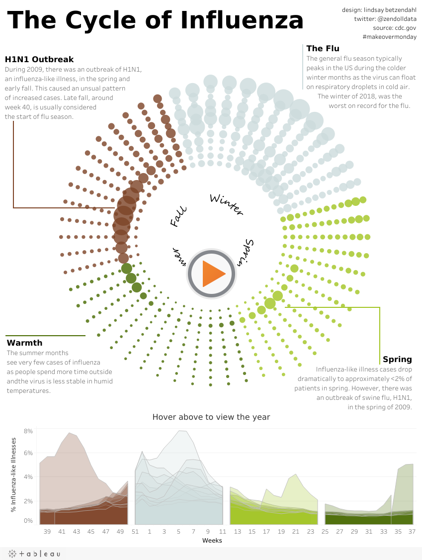
Can’t see this viz? View it here.
It presents information in a way nonanalysts understand
Raw data isn’t always palatable, but visualized data is dynamic and engaging. “Numbers are great, but they require language processing,” Betzendahl explains. “You have to read the number and then interpret what it means. If folks want data to immediately create impact, visualization is best.” The circular visualization above shows that while winter is always the worst season for outbreaks, 2018’s winter was far worse than usual.
“You can have the best information in the world, but if it’s buried in a boatload of tables, numbers, and words, the average person can’t do much with it.”
You can shrink big data down into digestible insights
Thousands, perhaps millions, of rows of data plus additional calculations and columns in a spreadsheet are seamlessly transformed into a single visual. “You can have the best information in the world, but if it’s buried in a boatload of tables, numbers, and words, the average person can’t do much with it,” Betzendahl says. In the influenza viz, percentages come to life as dots shrink and expand relative to the figures they represent.
Visualization illustrates trends you might otherwise have missed
With spreadsheets, finding a trend can be like looking for the proverbial needle in a haystack. A viz that shows a drastic difference can shine a light on an aberration, such as the 2009 outbreaks shown in light green that occurred in the spring—an anomaly as typical flu seasons go. “Data visualization allows you to suddenly see those trends from millions of rows of records. You can review an entire population or a decade of data in a glimpse,” Betzendahl says.
It gives depth and dimension to your data
When you need to show more facets of your data than a static graph can convey, an interactive data visualization can add layers to your data and answer more questions in depth. You’re able to get a major level of detail, then give users a way to explore that data with interactivity like drop-downs, hovers, and other real-time changes.
Note: Don’t worry if you lack your own data—there’s plenty out there!
There’s plenty of publicly available data if you haven’t collected your own. Betzendahl says, “Open data is a much bigger phenomenon these days—there’s a demand for free data, and it’s become widely accessible.” She suggests checking out data.world and online data sources and APIs such as Data.gov, AWS’s public datasets, Pew Research, Google Trends, and Facebook’s Graph API to start.

.avif)


Latest articles